Why Your Book's Cover Is Important

Don't judge a book by it's cover. An old adage that means you shouldn't judge something or someone just by the way they look. It's great when talking about people. However, when talking about books, that actually doesn't work. The cover is a big factor to anyone picking up a book.
You can use the information from this post while designing your own book's cover, whether for fun or for self publishing. All tips are my opinion, so if you think differently, that's okay.
A Great Cover is Vital
Think about the last book you picked up, whether it was from the library or a bookstore. What initially drew you in? Was it the title? An interesting blurb on the back? Or a cool cover? While the other two are equally important (and of course actually having a good story inside the book), the cover is a big part.
Look at this cover:

Guessing by the boy on the cover, what would you think this book was about? Certainly not a boy from the Victorian era. Much less Sherlock Holmes. That hairstyle is nothing like they had back then and completely ruins the cover for me.
Now look at this one:
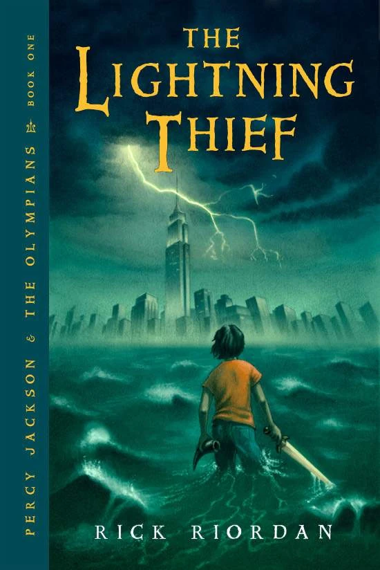
It draws you in. It makes you ask questions and want to turn the book over and see what it says. Who is the boy? Why does he have a sword? Is that the New York skyline? Unlike the Sherlock book, which was quite good despite the cover, this an intriguing cover.
What Makes A Good Cover?
There are several factors that make a good cover. Remember, a good cover is one that attracts a reader. If you can't attract a reader from the outside, no matter how good the story is they may not read it.
1. The letters of the title are readable. This is a pet peeve of mine. What's the point of a title if you can't read it? I've seen titles written is such fancy, swirly font you can barely make out the words. That is an immediate turn off for me. If I can barely read what it's called, why would I want to read it?
2. It draws your eye in. If you are a photographer or artist you'll know about good composition. Just because it's a book cover, that doesn't mean it can't have those things. If you don't know much about composition, learning about things like the rule of thirds, triangles in composition, and grounds- foreground, background, and middle ground- will help.
3. It makes you ask questions. There are good books with covers that don't do this, but it helps. When a cover and/or title make you ask questions, then you'll want to turn it over to learn the answers.
4. A good color scheme. No one wants to look at something that's an explosion of colors or is full of clashing colors in an unattractive way. The Percy Jackson book has a nice muted color scheme with highlights of lighter, brighter colors. You don't want your book cover to repel potential readers just because you hurt their eyes with the colors.
Using these tips, try designing a cover for your book, just using something like Picmonkey and free pictures from the internet. See what you can come up with. Readers are drawn to interesting covers, so use these tips to help make yours one that draws people in. I hope these help.
What do you like in a cover? What repels you? Tell me in the comments.


Comments
Post a Comment